Python
Seaborn
Introduction to Seaborn Library in Python
Seaborn is a powerful Python data visualization library built on top of Matplotlib. It provides a high-level interface for creating attractive and informative statistical graphics. Seaborn simplifies the process of creating visually appealing visualizations, making it a popular choice among data scientists and analysts.
What is Seaborn?
Seaborn is an open-source Python library that is specifically designed for data visualization. It offers a wide range of statistical plots, color palettes, and themes to create aesthetically pleasing and informative visualizations. Seaborn builds upon Matplotlib and provides a higher-level API, making it easier to use and customize plots.
Key Features of Seaborn:
Seaborn comes with several features that make it a valuable tool for data visualization:
- High-level plotting functions: Seaborn provides a set of high-level functions that simplify the creation of complex visualizations with concise code.
- Statistical data visualization: Seaborn integrates statistical techniques with visualization, enabling users to explore relationships and patterns in their data.
- Attractive default styles: Seaborn includes visually appealing default styles and color palettes that enhance the aesthetics of plots.
- Integration with Pandas: Seaborn seamlessly integrates with Pandas, making it easy to work with data frames and perform visualizations on structured data.
- Wide range of plot types: Seaborn offers a variety of plot types, including scatter plots, line plots, bar plots, histograms, box plots, violin plots, and more.
- Customizability: Seaborn provides flexible options for customizing plots, such as adjusting colors, styles, and themes to match specific requirements.
Installation of Seaborn
To use Seaborn, you need to have Python and the Seaborn library installed. You can install Seaborn using pip, a package manager for Python. Simply run the following command in your terminal:
pip install seaborn
Importing Seaborn
Once installed, you can import Seaborn into your Python script or Jupyter Notebook using the following import statement:
import seaborn as sns
Visualizing the data using Seaborn
Seaborn provides various types of plots that can be used for different kinds of data and requirements. Some of the commonly used plots are
- Line plot
- Scatter plot
- Bar plot
- Histogram
- Violin Plot
- Pair Plot
Line Plot
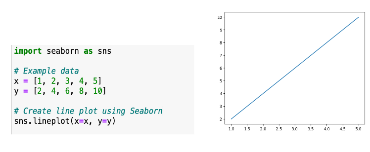
A line plot represents the trend or progression of a variable over time or any continuous variable. Seaborn's lineplot() function can be used to create line plots. Line plots are effective for visualizing trends, comparing multiple lines, and showing changes over a continuous interval.
Scatter Plot
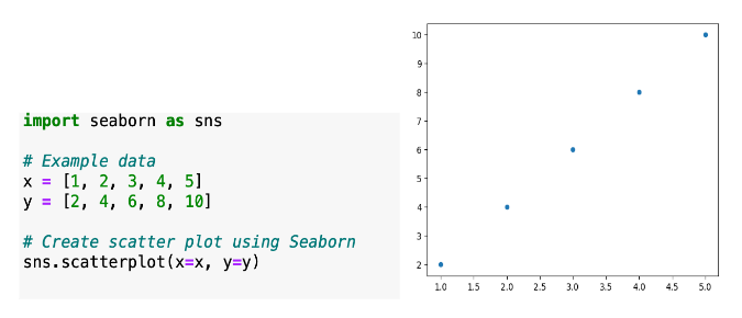
A scatter plot displays the relationship between two numerical variables. It can be created using the scatterplot() function in Seaborn. Scatter plots are useful for identifying patterns, trends, and correlations between variables.
Bar Plot
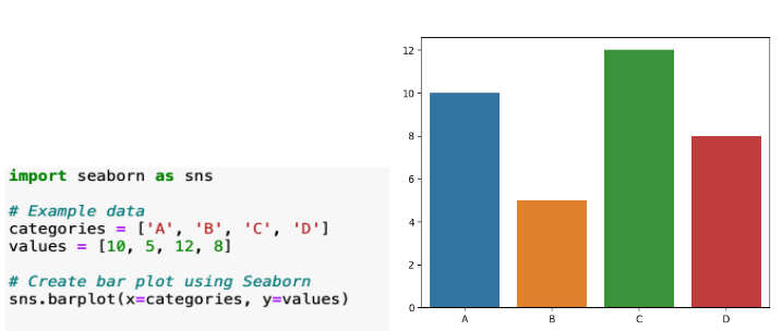
Bar plots are used to compare categorical variables or display the distribution of a single categorical variable. Seaborn's barplot() function can be used to create bar plots. They are suitable for showing comparisons, highlighting differences, and visualizing categorical data.
Histogram
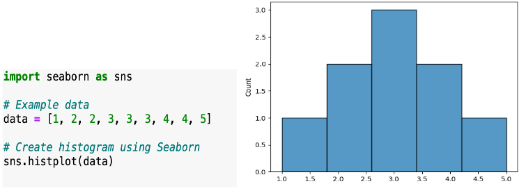
Histograms show the distribution of a single numerical variable by dividing it into bins and displaying the count or frequency of values in each bin. Seaborn's histplot() function can be used to create histograms. Histograms are useful for understanding the shape, spread, and central tendency of a variable.
Violin Plot
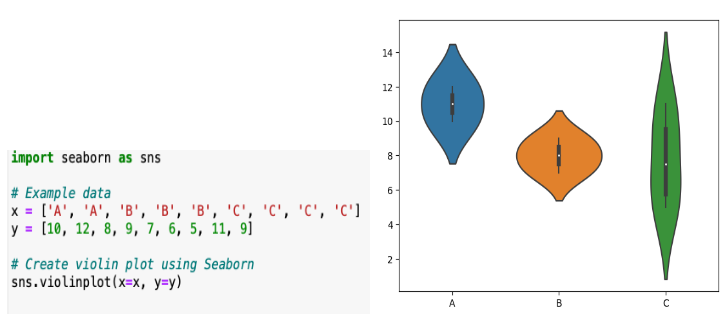
A violin plot is similar to a box plot but also includes a rotated kernel density plot on each side, which provides a more detailed view of the data distribution. Seaborn's violinplot() function can be used to create violin plots. Violin plots are effective for comparing distributions and understanding the density of the data.
Pair Plot
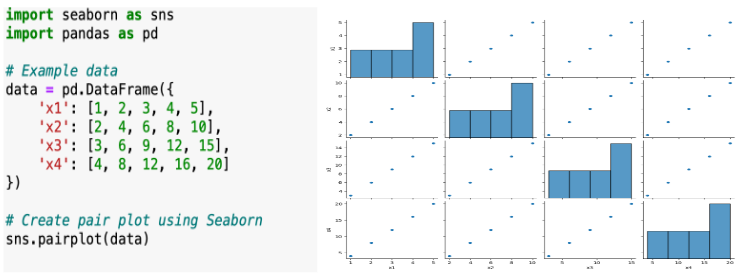
A pair plot, also known as a scatterplot matrix, displays pairwise relationships between multiple variables in a dataset. Seaborn's pairplot() function can be used to create pair plots. Pair plots are useful for identifying correlations, patterns, and outliers in multivariate data.
Matplotlib VS Seaborn
The choice between Seaborn and Matplotlib depends on your specific requirements and preferences. There is no definitive answer to which one is better, as both libraries have their strengths and weaknesses. Here are some factors to consider when deciding which library to use:
- Ease of Use: Seaborn generally has a more user-friendly and intuitive API compared to Matplotlib. It provides high-level functions that make it easier to create complex statistical plots with fewer lines of code. If you prefer simplicity and ease of use, Seaborn might be a better choice.
- Plot Customization: Matplotlib offers extensive customization options, allowing you to have precise control over individual plot elements. If you require fine-grained control and want to create highly customized plots, Matplotlib might be a better fit for your needs.
- Default Aesthetics: Seaborn focuses on providing visually appealing default styles and themes. It applies consistent colors, styles, and plot layouts, resulting in attractive plots without much customization. Matplotlib, on the other hand, requires more manual effort to achieve aesthetically pleasing plots. If you prioritize aesthetics and want visually pleasing plots without much customization, Seaborn may be preferable.
- Statistical Visualizations: Seaborn specializes in statistical visualizations and provides high-level functions for creating various statistical plots. It offers convenient APIs for plots like box plots, violin plots, bar plots with error bars, etc. If your data analysis heavily relies on statistical visualizations, Seaborn can be a valuable tool. Matplotlib also supports statistical visualizations, but it may require more manual effort to create specialized plots.
- Integration: Seaborn is built on top of Matplotlib, which means you can still access the underlying Matplotlib functions if needed. This makes it easy to combine the strengths of both libraries and leverage Matplotlib's versatility when required.
Conclusion
In this blog, we delved into the introduction of the Seaborn library, a powerful tool for data visualization in Python. We explored various aspects of Seaborn, from installation to creating different types of plots. While both Matplotlib and Seaborn are widely used visualization libraries, Seaborn offers a higher-level interface and a more aesthetically pleasing style, we highlighted the simplicity and elegance of Seaborn's syntax, making it an excellent choice for both beginners and experienced data practitioners. Seaborn's extensive documentation and integration with other Python libraries, such as NumPy and Pandas, further enhance its capabilities and flexibility.
the choice between Matplotlib and Seaborn comes down to personal preference and the specific requirements of your visualization task. However, Seaborn's rich functionality, ease of use, and visually appealing plots make it a compelling option for data visualization in Python.
