Python
Unveiling the Magic of Matplotlib: Exploring Python's Data Visualization Library
Introduction to Matplotlib Library in Python
We will be using the Matplotlib library for Data Visualisation of complex patterns of the dataset. So, it helps to understand the patterns, and tendencies in the data to the data analysts or data scientists so that they can come to some conclusion.
In this blog, we will see what Matplotlib is. How to install matplotlib? various types of plots using Matplotlib. So let’s start it.
What is Matplotlib?
Matplotlib is an open-source library that is used for visualising any data using various kinds of plots. It was written by John D. Hunter in 2003. According to the recent release, the latest version is Matplotlib 3.7.0(Feb 13, 2023).
Matplotlib is a popular data visualisation library in Python that provides an easy-to-use interface for creating high-quality plots and visualizations. It is widely used in data science and scientific research to visualize data, explore patterns, and communicate insights.
Installation of Matplotlib
- Install Matplotlib using CMD: If Matplotlib is not installed on your machine, you can install it using pip. Open up your command prompt or terminal and type the following command:
pip install matplotlib
- Install Matplotlib using Anaconda prompt: You can install matplotlib using the ‘conda’ command in the Anaconda prompt as shown below:
conda install matplotlib
So we have installed the matplotlib library in our system, and we will dive into different topics.
Visualizing the data using matplotlib
Matplotlib provides various types of plots that can be used for different kinds of data and requirements. Some of the commonly used plots are
- Line plot
- Scatter plot
- Bar plot
- Histogram
- Boxplot
- Pie charts
Line Plot
A line plot, also known as a line chart or line graph, is a chart commonly used to visualize the relationship between two variables. It consists of a series of data points connected by straight lines. The plot() function in Matplotlib is used to plot the x and y coordinates.
The syntax follows as below:
matplotlib.pyplot.plot(*args, scalex=True, scaley=True, data = None, **kwargs)
Parameters:
- x,y: These parameters are the horizontal and vertical coordinates of the data points.
- data: This parameter is optional and it is an object with labeled data.
- scalex, scaley: These parameters determine if the view limits are adapted to the data limits.
Scatter Plot
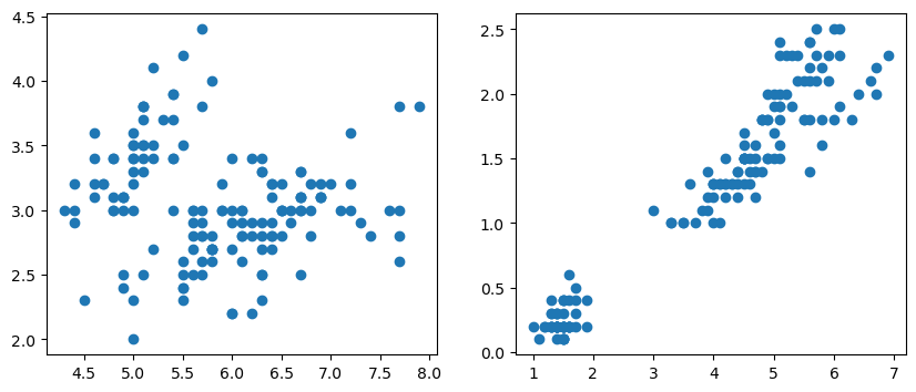
A scatter plot is a type of chart that is used to visualize the relationship between two variables. It consists of a series of points on a two-dimensional plane, where each point represents the value of both variables.
In a scatter plot, one variable is plotted on the horizontal x-axis, while the other variable is plotted on the vertical y-axis. Each data point is then represented by a point on the chart. The position of the point on the chart indicates the value of the two variables for that data point.
Scatter plots are useful for identifying patterns and relationships between variables. They can be used to determine if there is a correlation between the variables and if so, whether the correlation is positive or negative.
Scatter plots can also be used to display multiple groups or categories of data, where each group is represented by a different color or symbol on the chart. This allows for easy comparison between groups and can help identify differences or similarities in the data. The syntax follows as below:
matplotlib.pyplot.scatter(x_axis_data, y_axis_data, s, c, marker, camp, vmap, vmin, vmax, alpha, linewidths, edgecolors)
Parameters:
- x,y: These parameters are the horizontal and vertical coordinates of the data points.
- s: This parameter indicates the marker size. It is an optional parameter and the default value is None.
- c: This parameter indicates the color of the sequence and it is an optional parameter with a default value equal to None.
- alpha: This option indicates the blending value, between 0 (transparent) and 1 (opaque).
Bar Plot
A bar plot, also known as a bar chart, is a type of chart that is used to compare categorical data. It consists of a series of bars, where the height of each bar represents the value of a particular category or group.
In a bar plot, the categories are plotted on the horizontal x-axis, while the values are plotted on the vertical y-axis. Each category is represented by a separate bar, and the height of the bar represents the value for that category.
Bar plots are useful for comparing the values of different categories or groups. They can be used to show which categories have the highest or lowest values and to identify any trends or patterns in the data.
Bar plots can also be used to display multiple sets of data side-by-side, where each set of data is represented by a separate group of bars. This allows for easy comparison between different sets of data and can help identify differences or similarities in the data. The syntax follows as below:
matplotlib.pyplot.bar(x, height, width, bottom, align)
Parameters:
- x: sequence of scalars representing the x coordinates of the bars. align controls if x is the bar center (default) or left edge.
- height: scalar or sequence of scalars representing the height(s) of the bars.
- width: scalar or array-like, optional. the width(s) of the bars default 0.8
- bottom: scalar or array-like, optional. the y coordinate(s) of the bars default None.
- align: {‘center’, ‘edge’}, optional, default ‘center’
Histogram
A histogram is a type of chart that is used to visualize the distribution of a dataset. It consists of a series of vertical bars, where the height of each bar represents the frequency or count of data points within a particular range or bin.
In a histogram, the x-axis represents the range of values in the dataset, while the y-axis represents the frequency or count of data points within each range or bin. The bars are typically adjacent and of equal width, and the height of each bar corresponds to the number of data points that fall within that particular range.
Histograms are useful for visualizing the shape of a dataset, including its central tendency, variability, and potential outliers. They can be used to identify patterns and trends in the data and to highlight any areas of the distribution that may be of interest.
Histograms can also be used to compare the distributions of multiple datasets side-by-side, where each dataset is represented by a separate set of bars. This allows for easy comparison between different datasets and can help identify differences or similarities in the data. The syntax follows as below:
matplotlib.pyplot.hist(x, bins=None, range=None, density=False, weights=None,histtype='bar', align='mid', orientation='vertical', rwidth=None, log=False, color=None, label=None, stacked=False, *, data=None, **kwargs)
Parameters:
- x: sequence of arrays or arrays themselves
- bins: The optional parameter contains an array of weights with the same dimensions as the x bottom location of each bin's baseline.
- range: An optional parameter represents the upper and lower range of bins.
- density: Boolean values are contained in the optional parameter.
- weights: This parameter can be an integer, a sequence, or a string.
- histtype: The type of histogram [bar, bar stacked, step, stepfilled] is an optional parameter; the default is "bar."
Box Plot
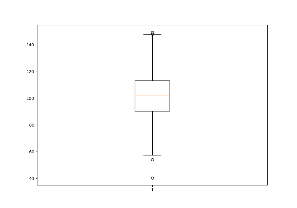
A boxplot, also known as a box-and-whisker plot, is a type of chart that is used to visualize the distribution of a dataset. It consists of a box that represents the middle 50% of the data, with a vertical line inside the box indicating the median value.
The box is typically divided into quartiles, with the lower quartile(Q1) represented by the bottom of the box and the upper quartile (Q3) represented by the top of the box. The distance between Q1 and Q3 is called the interquartile range (IQR), and the whiskers (lines extending from the right and left of the box) represent the range of the data that falls within 1.5 times the IQR.
Any data points that fall outside the whiskers are considered outliers and are typically represented as individual points on the chart.
Boxplots are useful for identifying the central tendency, variability, and any potential outliers in a dataset. They can be used to compare the distributions of multiple datasets side-by-side and to identify any differences or similarities in the data. The syntax follows as below:
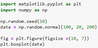
matplotlib.pyplot.boxplot(data, notch=None, vert=None, patch_artist,widths=None)
Parameters:
- data: The data should be an array or sequence of arrays that will be plotted.
- notch: This parameter accepts only Boolean values, either true or false.
- vert: This attribute accepts a Boolean value. If it is set to true, then the graph will be vertical. Otherwise, it will be horizontal.
- widths: It accepts the array of integers which defines the width of the box.
- patch_artist: this parameter accepts Boolean values, either true or false, and this is an optional parameter.


Introduction to subplots in matplotlib
Subplots are useful when you want to plot multiple data sets on the same figure. There are a number of ways to create subplots in matplotlib. In this tutorial, we will take a look at two of the most common ways: using the subplot() function and using the subplots() function.
We will also take a look at how to change the size and position of subplots in matplotlib. By the end of this tutorial, you will know how to create subplots in Python using matplotlib!


Which One To Use For Data Visualization? (Matplotlib or Seaborn)
Although the capabilities of Matplotlib and Seaborn are somewhat different, it ultimately comes down to personal preference when choosing one of them for data visualization.
Matplotlib is the basic go-to option when it comes to creating data visualizations. The wide range of customization options allows it to be used in a variety of scenarios, from basic data plotings to complex interactive plots. It is also great for creating informative graphics that don't require a high level of customization.
Meanwhile, Seaborn is best for anyone who wants to create more aesthetically pleasing visualizations. It comes with a pre-established set of plot styles, which give visualizations a more attractive feel. However, it does not offer a lot of customization options and can fall short of more intricate data representations.
Ultimately, users should choose the option that best suits their workflow and the visualizations they would like to create. Matplotlib and Seaborn each have their own advantages and can generate high-quality visualizations in different circumstances.
Conclusion
In this blog, we learned about the introduction to matplotlib library. We saw how to install matplotlib and how we visualized the different plot types. Matplotlib and Seaborn are two popular data visualization tools, but it ultimately comes down to personal preference. Histograms and boxplots are two types of charts used to visualize the distribution of a dataset. Histograms are used to identify patterns and trends, while boxplots are used to compare the distributions of multiple datasets.
