Python
How to Choose the Right Visual to Tell Your Data Story: Tips from ‘Storytelling with Data’


How to Choose the Right Visual to Tell Your Data Story: Tips from ‘Storytelling with Data’
In the data-driven world, Data Visualization plays a major role. However, not all visuals are equally effective in presenting the information. To create an impactful dashboard, it’s essential to identify the most relevant visuals. This blog aims to provide a comprehensive list of such visuals that can prove useful in creating an effective dashboard.
SIMPLE TEXT:
When we want to show the data, normally our brains think of tables or graphs. But we should not forget that we have another tool named simple text. When we have just a number or two to show, then showing just the number itself is much more powerful than burying them in a table or graph: putting just a couple of numbers into tables or graphs causes them to lose some of their vigors.
Suppose, we want to mention: In a recent survey we asked our users if there is anything they would like to see us change.
Eg: Then we can represent it only like this, then using pie charts, bar graphs, etc, (to avoid complicating things)
- NO CHANGES REQUIRED - 88%
- CHANGES REQUIRED - 9%
- DON’T KNOW EXACTLY - 3%
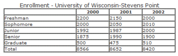
TABLES:
Tables are a useful means of exhibiting numerical or categorical information in a structured form. With their ability to simplify comparisons, they're ideal for presenting extensive amounts of data in condensed form. Nonetheless one should exercise caution when utilizing tables with detailed datasets as their efficiency may become compromised if they aren't formatted appropriately. It is also important to maintain appropriate headings.
Eg:
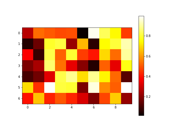
HEAT MAP:
Heat maps are quite popular for using color coding to represent the values in a matrix. They are very useful to identify the patterns and trends for complex datasets, particularly for areas of high concentration. The important aspects while creating heat maps are the proper color scheme, and labeling the axis and legend. It is commonly used in website activity tracking, market research, and in other places to identify any important information quickly.
Eg:
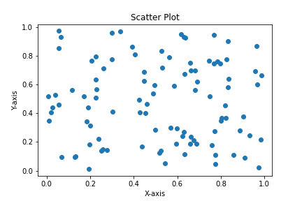
SCATTER PLOT:
A scatter plot is mainly used to identify relations between the two variables. It easily recognizes patterns, trends and. It displays the data as points, where the position of each point represents the values of the two variables on both axes. It helps to find if there is any positive or negative or no correlation between the variables, it also helps to identify outliers or any unusual patterns.
Eg:
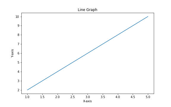
LINE GRAPHS:
Line graphs are mainly used to identify the changes in data over time. They are also used to identify trends, patterns, and relations between the variables. They display points with a line connecting them. The main use of this is that we will get to know easily the increases or decreases over time the period.
Eg:
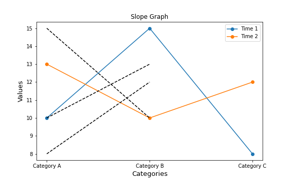
SLOPE GRAPH:
A slope graph is used to compare the changes between two time periods. There will be two lines on the graph and each line represents a specific period. The slope of the lines shows the rate of changes in the data. They are used to identify trends or changes in data over time while comparing two time periods. It is not suitable for all types of datasets. If it is used properly it helps to display complex data in a clear and precise manner.
Eg:
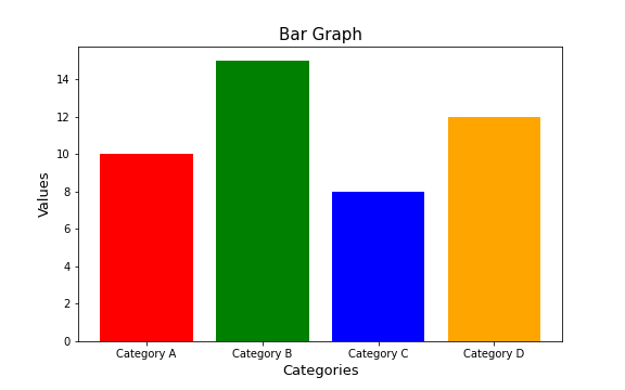
BAR GRAPH:
Bar graphs are generally used to compare values of different categories of data. It displays data in the form of bars with different heights. It also helps to identify patterns. They are also used in industries like markets, finance, etc to display data in a visually appealing manner.
Eg:
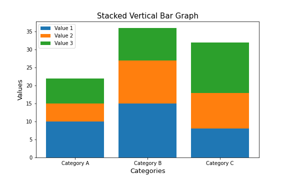
STACKED VERTICAL BAR GRAPH:
The stacked vertical bar chart’s main intention is to show how different categories contribute to the total value of a group in a vertical manner. It is the next version of the bar graph, where each bar contains stacked segments, the segments represent different categories. They are useful in comparing the composition of multiple segments and also identifying trends or patterns.
Eg:
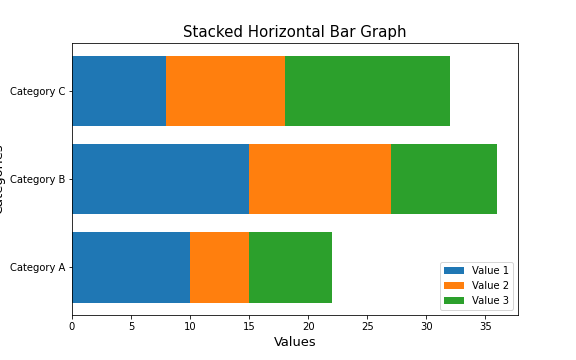
STACKED HORIZONTAL BAR GRAPH:
The Stacked horizontal bar is just opposite the Stacked vertical bar chart. This chart’s main intention is to show how different categories contribute to the total value of a group in a horizontal manner. It is the next version of a bar graph, where each bar contains stacked segments, and the segments represent different categories. They are useful in comparing the composition of multiple segments and also identifying trends or patterns.
Eg:
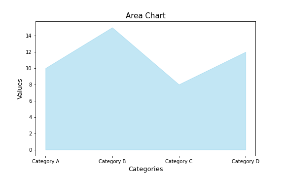
AREA CHART:
Area graphs should be avoided in most cases as human eyes don't do a great job of attributing quantitative value to two‐dimensional space which can render area graphs harder to read than some of the other types of visual displays. In one exception, an area chart can be used when we have to visualize the numbers of vastly different magnitudes.
Eg:
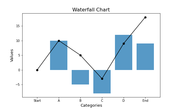
WATERFALL CHART:
The waterfall chart can be used to pull apart the pieces of a stacked bar chart to focus on one at a time, or to show a starting point, increases and decreases, and the resulting ending point. In the below figure, we can clearly see that it shows how headcount changed over the past year for the client group you support.
Eg:
In summary, we have discussed the most commonly used types of graphs, although there are many more to choose from. It is crucial to master the basics of data visualization before exploring more complex types of graphs. When selecting a graph, prioritize choosing one that effectively communicates your message to your audience. With less familiar types of graphs, extra care should be taken to ensure they are easily accessible and understandable. I hope this article has provided helpful insights for choosing the right chart. Your feedback and suggestions are welcome. This information is sourced from "Storytelling with Data '' by Cole Nussbaumer Knaffic.
about the author
Prakruthi N
Prakruthi N Guptha completed her undergraduate degree at Bangalore University. Throughout her studies, she developed a strong desire to keep up with the latest advancements in business intelligence. She was determined to become knowledgeable in Data Analysis and build a rewarding career in this field. As Prakruthi immersed herself in the subject, she enthusiastically explored various tools and techniques, finding them truly captivating and incredibly fascinating.
